For “Graphically-Challenged” Writers, and People Who Like Muhummad Ali, Cats, or Spaghetti
A review of Webinar: Tips for Graphically Challenged Technical Writers
Presented by STC Rochester and STC Central New York Chapters
Bobbi Werner wrote a lovely and cleverly-titled blog post on this same webinar, Drawing the Line: Where Technical Illustration Fits in Tech Comm.
Presenters:
Laurie Fiaretti, Technical Illustrator (LinkedIn: Laurie Fiaretti)


The first version of this blog post draft was nearly complete when I lost it.
I know, how is that even possible? That’s 2020 for you. Silver lining: the content from this webinar is useful and the additional review helps to lock it in. Notes follow.
Alignment & Grids, A Design Primer
John Freiberger, “Primarily a tech writer but with illustration experience”
Tools used: Biz characters created by pikisuperstar freepik.com
John’s presentation is excellent but as it progresses, I’m driven to distraction by an appreciation of something else: his consistency. This is what I admire about every John Freiberger presentation I’ve seen so far:
Sources at the bottom of each slide, and on the Outro slide
Informative Intro and Outro slides
Well-structured and polished decks follow logical flows
Useful graphics
This presentation summarizes the most-useful content John gleaned from a master’s degree program at SUNY Polytechnic Information Design.
Alignment
Create a uniform presentation by aligning objects to edges or a common center (smaller objects). This helps the user find logical flow.
The grid system pairs larger objects by rows and columns. This helps the content make sense because people tend to seek out visual relationships.
As John demonstrates by way of a fictitious business card, vertical alignment shows information hierarchy or structure, and horizontal alignment groups objects together.
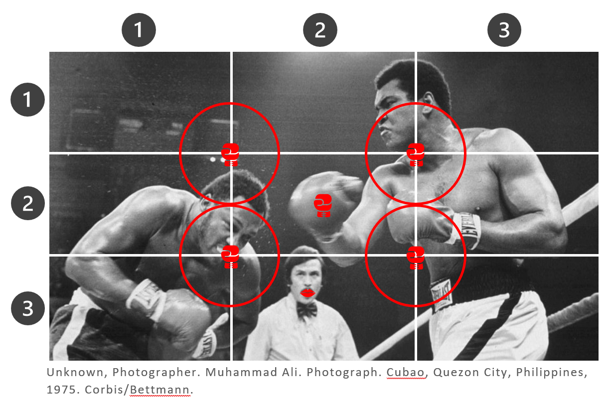
A trick from John’s graduate studies: Rule of 3rds, AKA Golden Grid Rule:
1. Divide the area into grid three blocks wide x three blocks high (9 blocks total featuring 4 intersections). For a larger picture, you can divide the area into 5 blocks instead of 3.
2. Place the design’s primary elements in the intersections, which are “visual sweet spots”.
John demonstrates creating a grid for a recognizable Thrilla in Manilla photo. Nobody recommends using Word for graphics, but I do here anyway because I’m a loner Dottie, a rebel:

Styling of Objects
Matt Reiner, “Diverse background from Tech world with emphasis on UX”
Tools used: Draw.io, Canva
Matt has glorious curly hair and makes Confluence-residing tech-writing apps for K15t, a company passionate about good design. He realistically posits, “Can I make illustrations and diagrams look as good as what our pro designers put together? Sometimes the answer is no.”
For those times when there’s no choice but to try, he uses Draw.io or Gliffy web-app based diagraming tools, which are akin to Microsoft Visio.
“This is exceptionally ugly, I’ll admit”, he declares as he pulls up a basic diagram in draw.io. He demonstrates how to modify it to align to a style guide as he deftly adjusts factors such as shapes, colors, gradients, and line width.
Features he appreciates include the ability to edit style as value pairs, apply style across elements, and set a default style for company-wide use.
Check out a live example of a tree-looking diagram he created with draw.io on this k15t microsite.
Matt’s Marketing team uses Canva for simple diagrams. He uses it for frames, which automatically standardizes image sizes for consistency. Canva has a paid Brand Kit feature. (I personally use a similar Venngage feature.)
When to Ask for Outside Help (vs. Doing It Yourself)
Dara Barley, “Specialist on Tech pubs with background in Chemistry”
Dara and her adorable pixie cut work at Infocon Systems which—don’t quote me on this—is a chemical instrumentation warehouse in Syracuse?
She acknowledges that, by nature, a Technical Communicator is a knowledge-seeking missile who wants to do things independently (paraphrasing). She tends to tackle things herself but graphics are not in her job description. The trick is to consider: how justifiable is the time you spend on a design? To determine, you need to survey what goes into the effort (and what you get out of it).
She gives an example in which her company remarkets a leak detector for the automotive industry. A Coworker finds an old graphic that they recycle with some tweaking. Dara tries Adobe Illustrator and after 30 minutes, realizes it to be an all-afternoon project. Not to fall prone to the sunk-cost fallacy, she calls the in-house Graphic Designer, who does in ten minutes.
In classic 2020 fashion, the graphic designer she worked with closely was just let go “last Friday”. It’s expensive for a company to outsource services so she must roll with the cost analysis punches.
I don’t have details on Laurie Fiaretti’s excellent presentation Tips for Non-Technical Illustrators here, but you can check it out on the recording. She goes over topics such as The Grid System, when to use a photo v. illustration, and repurposing pre-existing source material.
Post-presentation the conversation flows on for a half-hour between the speakers and attendees as they discuss online and print resources they recommend. I listen in and secretly assign attendees to Every Type of Zoom Call Participant, Illustrated by Cats. When John mentions a software tutorial that instructs the user to draw a plate of spaghetti, I begin to wholly obsess over spaghetti. I text my husband the dinner request and he gets cooking.
I think I take for granted that graphics play an important role in a document. I don’t know if it’s my communication style, generation, or pasta-preparing graphic designer husband, but I can’t fathom a world without a balance of text and imagery. What would end-users do without infographics? Can you imagine how many words technical writers would need to use in a world without illustration?
It’s a great idea to acknowledge the role and skillset of Technical Illustrators and to simultaneously admit that sometimes Writers must make do without one.
How writers and illustrators, both communicators, fit together is a solid webinar topic and an ongoing discussion. I’m glad STC CNY and STC Rochester put this together, and recommend that you click here to register and watch it.